Tag Archives: visual

Analysis of a Chair

I’ve always thought it might be helpful to have a way of determining the identity and style of a chair by using visual means rather than by memorizing the names of all sorts of periods and styles. Sure, one can attempt to divide all chairs into forty distinct styles, but that is more helpful after the fact. As a props person, we are often faced with an existing chair, or picture of a chair, and we need to discern its style so we can find more like it. “This chair has kind of a Chippendale back, but with turned legs. What is it?”

Well, I haven’t accomplished anything like that, but I have come across a series of plates in the book Furniture Designing and Draughting, by Alvan Crocker Nye, published in 1907. These plates break down and illustrate the variations in each of the parts of a chair. If you remove ornamentation and look at just the basic shapes, you can design almost any chair from Western furniture history simply by picking and combining these variations. Even with the rudimentary distillations of chair design in  these plates, you can create 486,000 distinct-looking chairs.
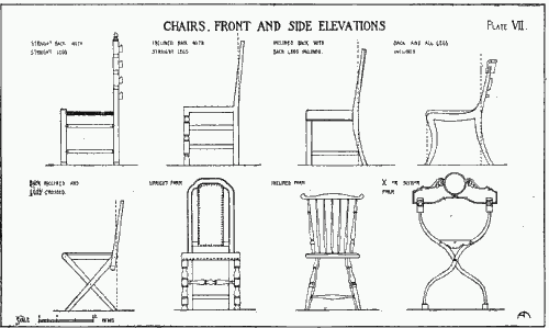
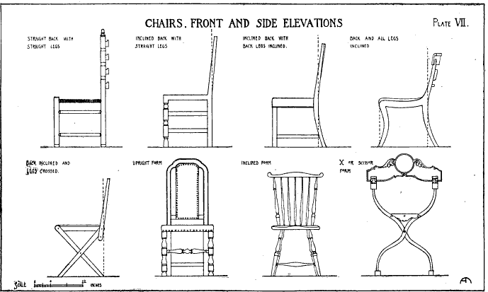
Chairs - Front and side elevations

Plate VII above shows variations on how the legs can be oriented. In the top row, we see side elevations of a chair with a straight back and straight legs, an inclined back with straight legs, an inclined back with back legs inclined, and the back and all legs inclined. In the second row, we see the back inclined and legs crossed, than front elevations showing an upright form, an inclined form, and finally an X or scissor form.
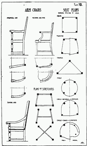
Arms, seats and stretchers

In Plate VII, we see the variations a chair’s arms can take. Under the “horizontal arm” drawing, we first see a plan showing how the orientation of the chair’s arm matches the shape of the seat. The two plans below it show how the arms curve out so the space between the arms is wider than the shape of the seat at the back. The two plans under the “receding arm post” show how the arm can be a compound curve or can be a continuation of the curve of the chair’s back. Finally, the elevation of the “sloping arm” chair shows that the arm can be higher in the back than in the front.

The plans of stretchers show how the reinforcing bracing of the legs can be arranged in either a box (trapezoid), an H, or an X (or cross) configuration.

Finally, the last column shows us different seat plans: square, trapezoid, triangle, circle, a circle and rectangle composite, and a circle and curves composite.
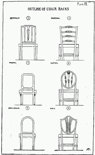
Outline of chair backs

Plate IX shows outlines of common chair backs. 1) Rectangular. 2) Trapezoidal. 3) Polygonal. 4) Elliptical. 5) Semi-circular. 6) Shield.
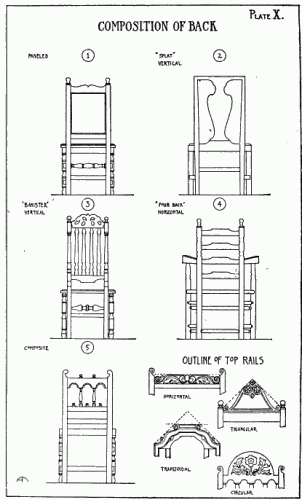
Composition of back
Composition of back

Plate X gives various compositions of the chair back. 1) Paneled. 2) “Splat”, vertical. 3) “Banister”, vertical. 4) “Four Back”, horizontal. Variations include the “Three Back”, or the much rarer “Five Back”. 5) Composite.

In the bottom right corner of the plate are four outlines of top rail shapes: horizontal, triangular, trapezoidal, and circular.

27 Visual Theatre Cliches

Though this is almost a month old, I’ve been wanting to get around to it. In Time Out London, Andrew Haydon has made a list of cliches of visual theatre that should be banned (The article has since disappeared from their website). He posits that these metaphorical objects and devices are so overused, that they’ve lost their impact. Here is the list with my commentary as it relates to props.

  • Battered brown leather suitcases – Just in the last two days, we’ve had 4 of our battered brown suitcases returned from shows that closed. Obviously it’s a popular item and your prop stock will benefit from having several. Just remember to do your research; the battered brown leather suitcase is not appropriate for every period and location. You certainly don’t find them in common use today.
  • Microphones – I assume he’s talking about microphones as a prop rather than to solve sound issues. I’d agree, mostly because as time goes on, the younger generations will be less familiar with their use (as most performers use nearly invisible mic packs) and would get less meaning out of their use on stage.
  • Accordions – Like the suitcase, this is fine if called for in the show and design. Again, they are less common throughout history then you may think.
  • Feathers falling from the ceiling – Sounds like the scenery department.
  • Sand – Scenery
  • Bowler hats – Costumes (or millinery, if your theatre is lucky enough to have that department). Though not props, I second their overuse.
  • Live video feeds / projection – Not props, but I’m not sure this is specific enough to be a cliche. It’s kind of like saying “hard surfaces” is a cliche.
  • Umbrellas – particularly when projected on or used to signify birds – I can’t say I’ve ever seen them used as birds, but in photography, umbrellas are most certainly overused as visual elements.
  • Shredded paper plus fan as snow – Is this a visual cliche? I think if a show calls for snow, this is a fairly cheap alternative to professional snow machines (less chemicals, too).
  • Ukuleles – Agreed.
  • Lots of big tellies – I’d agree this convention is used quite a bit. Still, if you walk around Manhattan, you’d find yourself surrounded by more moving video screens then even two years ago. They’re on buses, taxis, billboards, even shoes.
  • People climbing out of pieces of furniture – Not props.
  • Static/white noise during blackouts – Sound
  • Movement sequences instead of blackouts – Choreography
  • Rostra – Scenery
  • Blackouts – Not props, but really?
  • Polythene sheeting – Another “cliche” that is so broad I don’t know if it should be here.
  • String – And I thought the last one was too broad.
  • White face – Makeup.
  • No curtain call – Directing.
  • Clocks – counting down the seconds, stopped or running normally – I’d have to bring up my earlier argument about how younger and younger generations are less exposed to clocks (analog) than we might think, and would get less out of their use as convention.
  • Over- or under-sized furniture – I’m sorry to see this on the list, as these can often be really cool to build.
  • Laptops – Again, really? Their use is so ubiquitous these days, yet everything points to them becoming even more and more popular. Can you tell the stories of today without including the props of today? It’s like trying to tell the story of a waiter without using plates.
  • Nursery rhymes sung discordantly – “Visual” cliche?
  • Heartbeats – Again, “visual”?
  • Spooky children’s voices – possibly singing nursery rhymes, almost invariably – Ring-a-ring-a-roses. – Isn’t this one already in the list?
  • Sequences where all the performers talk in canon before ending abruptly with a scream – Yep.

As you can see, the list seems to be hastily put together. A number of them are not visual cliches, several seem to be more pet peeves than cliches, and a few are too broad to be considered cliches. If anyone out there has any additional ideas to add to this list, let me know!

New York Public Library Digital Galleries

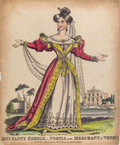
Miss Fanny Kemble as Portia in the Merchant of Venice

As a props person, you’re always looking online for images, whether as research for pieces, inspiration for set dressing, or as elements for a paper prop.

The New York Public Library has a great digitized collection of images in their Digital Gallery.  Some proptacular highlights include cigarette cards from pre-1900s to the mid-20th century; dust jackets from American and European books, 1926-1947; decoration in the Age of Napoleon; and  a collection of restaurant menus from 1851 to 1930.

There is also a ton of theatre-related photographs and ephemera, such as the Vandamm Studio Photographs of theatre productions and players from 1900 to 1957.

These digital galleries have so much visual reference and research; I highly recommend taking the time to look through it all and bookmarking or taking note of what you might find useful in the future.

How to research

Research is a vital skill for a props person. We may be given a vague description of an object or item and be expected to build something that is either historically accurate, or something that looks “correct”. For example, we all know what a dog looks like, but when we sit down to sculpt one, our minds become incredibly blank; details like the shape of the head, the proportion of the features, and how parts transition between each other are what will sell the prop. Even when a director or designer provides us with full drawings or draftings, we may still need to do research of our own to fill in the blanks or flesh out the specifics.

Continue reading How to research

Using Flickr for Visual Research

Flickr, if you don’t already know, allows people to share photographs. It’s a massive website, and you can easily get lost. I’ve broken it down to help you navigate around.

  • The Commons. The Commons is a place where organizations can post their massive image libraries. Some organizations include The Library of Congress, The Smithsonian, and the New York Public Library. Most of the images are documentary, so it is a good source for primary research into historical time periods. The organizations do a fair job of organizing their images, making specific pictures easy to find. Another great thing about the Commons is that many of the photographs are in the Public Domain (check each one to make sure), allowing you to use the image itself in a show without a license.
  • Places and Map. If you need photographs of a certain place, you can use these to find (usually contemporary) pictures taken there.
  • Groups. Users on Flickr can create their own groups, where they post pictures related to whatever the theme of the group is. Some groups are devoted to specific subjects; for example, you can find a group for vintage kitchen items, medieval combat, or battlefields. It’s not just for photographs; you can find vintage illustration, vintage cigarette ads, or maps and charts.
  • Tags. Flickr users can add keywords, or “tags” to their pictures to make searching for them easier. For instance, you can see all photographs tagged with “furniture“. This gives a lot of results, but you can further revise your search by looking at “clusters“, which are common groupings of related tags. For instance, furniture is clustered with “vintage, antique, old“.
  • Search. When all else fails, there’s good old-fashioned search. You can search through tags or descriptions. This is also where you can search for multiple tags, or search for a photos where one word appears and another doesn’t.