Tag Archives: set design

Salon on Being Green

Yesterday at Wingspace Theatrical Design I attended their salon on “Being Green.” The featured guests included set designer Donyale Werle (Bloody Bloody Andrew Jackson, Broke-ology), as well as Annie Jacobs and Jenny Stanjeski from Showman Fabricators.

A lot of the facts which were presented are better summed up in my post on a previous workshop I attended called “Going Green in Theatrical Design.” I did see something that was new though (new to me, that is): UC Berkeley’s Material and Chemical Handbook which presents some of the materials we commonly use in prop making, along with disposal instructions and safety notices. It’s specific to their college, but it is a good starting point for developing your own.

Since I didn’t take notes, what follows is more of a highlight of various points made in the discussion as I remember them:

“Being green is not black or white”; it is not an either/or proposition. Rather, every day you try to make better choices, and every show you try to do a little greener. It takes a lot of experimentation, a lot of analysis, and a lot of effort.

Do not do bad “green” design and art; it’s worse than no design. The goal is to make good design, and the goal of sustainable theatre is to do it a little greener each time.

As theatre people, we already come from a culture of sustainability and recycling. We reuse and repaint flats and drops. We take the lumber from one show and use it on the next. We borrow and barter the costumes and props from other people doing the same. But as our careers progress and the shows get bigger, we get away from that. Maybe it’s because you get to work with bigger budgets, or maybe it’s because you want to push your work to have higher production standards. Making sustainable theatre is a conscious choice and takes a concerted effort.

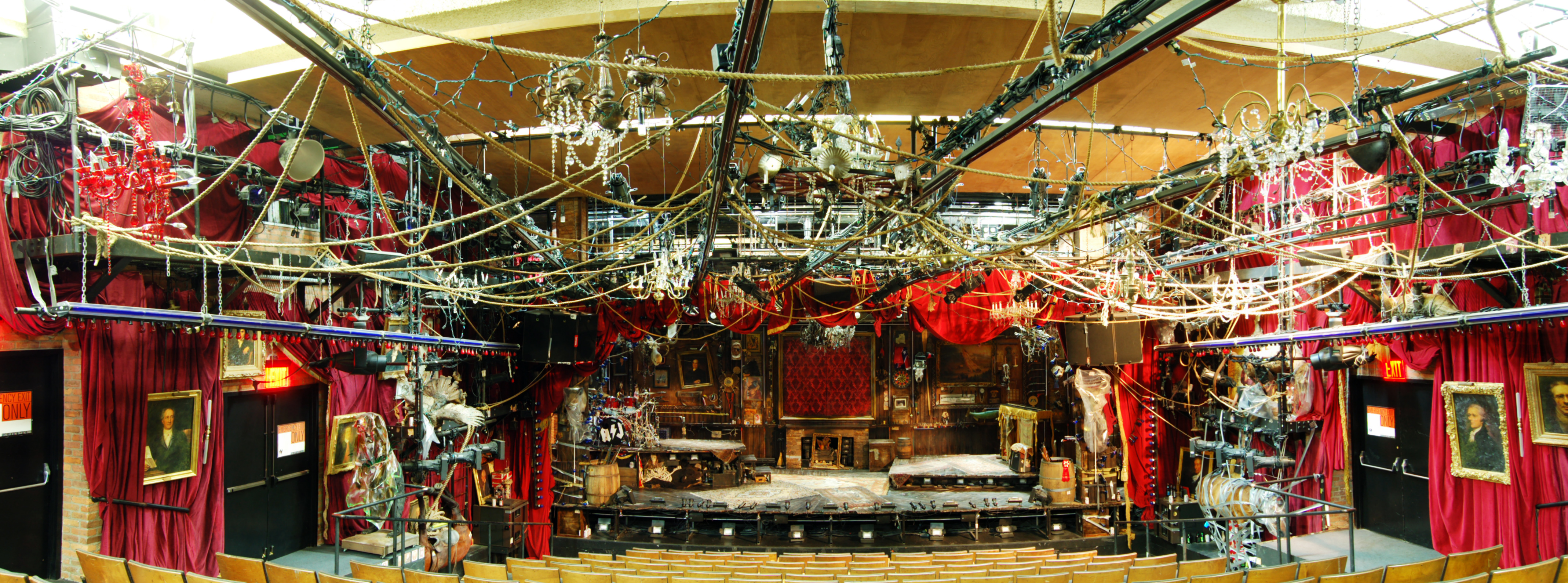
One of the problems, someone pointed out, was in trying to do a green production with a designer who was still in the old mindset—the mindset that everything has to be new and bought just for that show. What is the new mindset? It may mean a design which evolves from the available materials, rather than a design which starts on paper and then requires the purchasing of all new materials. Maybe it just means less design, though as Donyale pointed out, she likes a lot of “stuff” in her designs:

Bloody Bloody Andrew Jackson

Thinking about more sustainable options means taking more time out of your already busy schedule, and asking others to take more time as well. Donyale pointed out that if you can do case studies on what you’re spending versus what you would spend in a more traditional production, you can convince the producers; for Peter and the Starcatcher, she calculated that they saved $40000 in materials by using recycled, salvaged and upcycled materials, but that the labor cost was a third more due to all the sourcing and processing of this material. Still, it was an overall savings; the extra labor cost was offset by the reduced materials cost. Producers like to see savings. It is also, for a lot of us, morally preferable to have more of the money to go to human labor (which is sustainable) than to the purchase of materials shipped from across the globe which will end up in the trash once the show is finished.

For artisans and production people, as opposed to designers, using more sustainable techniques means taking time to do your own experimentation and comparison of materials and techniques to arrive at better solutions. If you can come up with concrete alternatives to show your designers, it becomes easier to convince them to trust you. An example the ladies from Showman gave was using carved homasote, which is made from recycled newspaper and non-VOC adhesives, to make faux brick and stone facades, rather than vacuum-formed plastic panels. Not only is the plastic a petroleum-based product shipped from overseas, but it releases toxic fumes when heated in the vacuum former. Homasote comes from a company in New Jersey, so it only has to travel a few miles. The results look the same, and the costs are comparable. By showing the designers what they can achieve with more sustainable and less toxic materials, it makes it easier to convince them to accept them.

Do the soldiers have swords or guns?

A design concept which pops up here and there is the “timeless” time period. Especially popular with Shakespeare and Greek classics, the designer and director wish to stage the play so that the scenery, costumes and props do not convey any specific time period. The goal is usually to allow the production to focus on the language, rather than worrying about all the historical minutia which comes from picking a specific time period and the inevitable anachronisms which will be introduced.

The problem which tends to creep up is that while “timeless” means everything comes from a vague time period, the props one uses have to be specific. All objects used by humans are inevitably colored by history and geography. While a designer may have an ever-morphing Platonic ideal of a piece of furniture swimming around in her or his head, the prop master must ultimately choose this furniture from a finite number of pieces.

My boss, Jay Duckworth, and I were talking about the questions which arise between a prop master and a set designer when such a situation occurs. Presented below is an imaginary conversation to further illustrate what might happen:

Prop Master: So I want to pick out some chairs. What period is this show set in?

Set Designer: It’s timeless. It is unrecognizable as any specific time period.

Prop Master: Great. But what period should the chairs be from?

Set Designer: They should not convey any period. They should be timeless.

PM: Okay. Wood timeless, or metal timeless?

SD: What?

PM: Should they be made out of wood or metal? Which is more “timeless”?

SD: Show me some options.

PM: Are they upholstered? Do they have arms?

SD: Whatever looks the least like any specific time period. They should be completely generic.

PM: Like, curvy generic? Or straight generic?

SD: No, they should look like the most representative example of a generic chair you can think of.

PM: So you want a contemporary chair.

SD: No, a timeless one.

PM: Great, we’ll come back to this. Now, there are soldiers in this play. Which country are they from, and which war did they fight in?

SD: They should not look like they come from any specific place or time. They are archetypes of a soldier throughout history.

PM: That’s cool. So… should they be carrying guns or swords? Are they from gun times? Or sword times?

SD: Whatever looks the most archetypal.

PM: It’s a pretty big investment to outfit fourteen soldiers with swords, sheaths, and sword belts only to decide later you want to switch to guns. Maybe they could have clubs?

SD: I want something that could kind of be “all weapons”. Something the audience might think is a sword at one point, but makes them think of a gun at another point. Nothing specific.

PM: Clubs it is. Now onto this letter. I just wanted your thoughts because it features so heavily in the action. Do you have any feelings about what the letter should look like?

SD: Like everything else. It should be timeless. An archetype of a letter.

PM: A paper archetype or a parchment archetype?

Set Dressing in The Intelligent Homosexual’s Guide to Capitalism and Socialism with a Key to the Scriptures

Last week at the Public Theater, our production of The Intelligent Homosexual’s Guide to Capitalism and Socialism with a Key to the Scriptures held its final performance. The set was a very realistic (and very cluttered) brownstone in Brooklyn, NY, circa 2007. In today’s post, I’m going to take a look at some of the little touches in the set dressing which you may not have noticed.

Bulletin Board
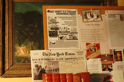
Bulletin board on the desk

In the farthest upstage left corner is a desk belonging to Gus, the father and apartment’s owner. The desk is overcome with papers, books, files, furniture and other knick-knacks from a lifetime of accumulation. Notice the article in The New York Times: “Dockworkers Slow Shipping.” In the course of the play, we learn that Gus was a longshoreman, and a strike by the dockworkers marked a turning point in his life. All of these papers and ephemera came from the Guthrie Theatre’s production, and were created there by Nick Golfis.

Bookshelf
The bookshelf in the room

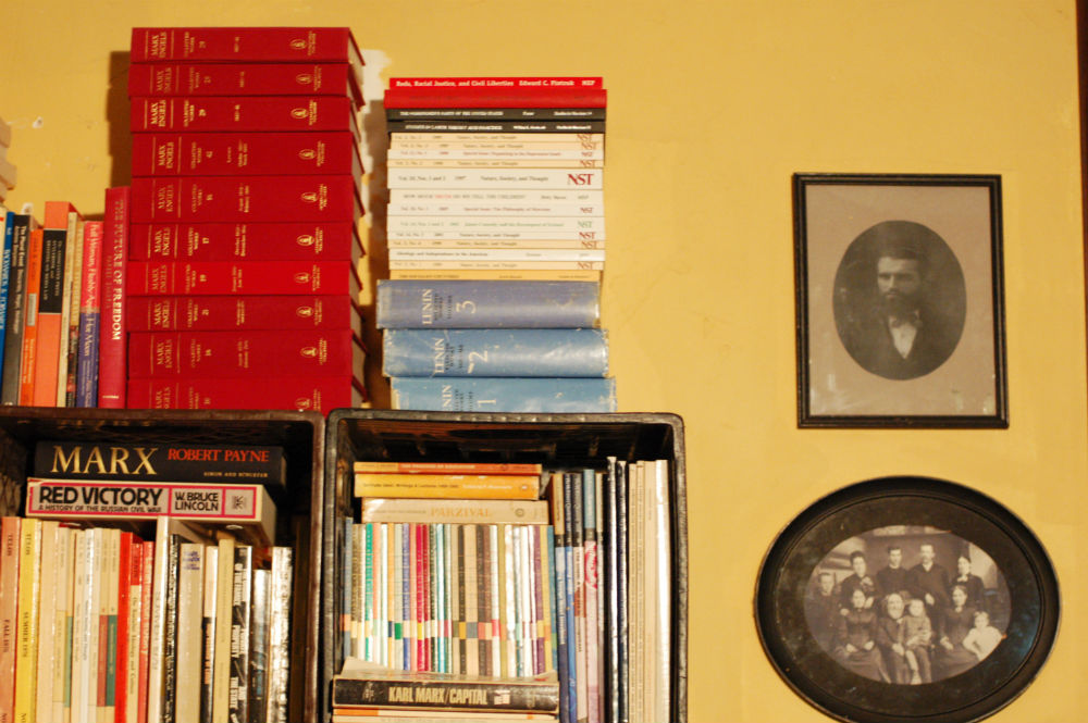
The set contained a large number of books—stacks and stacks of books, in fact. When the production moved from the Guthrie Theatre, many of these books came with it. However, most were law books and other nondescript leather-bound tomes. For our production, Tony Kushner and Mark Wendland (the set designer) decided we needed to replace as many of these as we could with a more realistic collection which Gus would have owned. If you took a closer look during the production, you would have noticed a remarkable collection of Communist, Socialist, Marxist and leftist books.

Inside of the broken wall

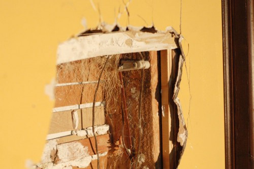
It is a shocking moment when Steven Pasquale first puts a statue through the wall of his father’s apartment. A close look at the wreckage would show the old and crumbly lath of the wall behind it, as well as the horsehair used to hold it all together. An even closer look would show cloth-covered wires along with porcelain electrical wire holders running along a wooden stud.

Phone number
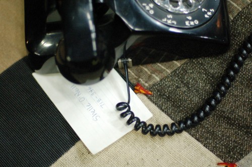
Phone number

Here’s something you wouldn’t have seen. Above the main set was Gus’ room. During various scenes throughout the play, the audience can see Gus in his room walking around, reading, writing and engaging in other solitary and silent business. At one point, he makes a phone call. Near the end of the play, a new character named Shelle O’Neill shows up with a “suicide kit” for Gus to use. If you watch the show again, you may infer that Shelle is the person Gus was phoning earlier. In the photo above, you can see a note card with Shelle’s phone number actually written on it next to the phone Gus used. This little detail was visible only to the actor playing Gus.

2011 Tony Awards for Best Scenic Design

Last night was the 65th Annual Tony Awards. As longtime readers of this blog know, there is no Tony Award for props, whether it’s props design or prop mastering (actually, there is very little recognition of the craft and labor of backstage theatre overall, but I digress). Instead, I will look at the Tony Award winners for Scenic Design, which encompasses the world of props.

Congratulations to Scott Pask, designer of The Book of Mormon, for his Tony Award for Best Scenic Design of a Musical. Scott is the designer for both Shakespeare in the Park shows this year, which began preview performances just this past week. I couldn’t find his acceptance speech online anywhere, so in lieu of that, here is a video in which he talks about the scenic design of The Book of Mormon.

You can also read a great feature on Playbill about the design of Book of Mormon, featuring a number of photographs of the sets as well as the scenic models.

The winner for Best Scenic Design of a Play went to Rae Smith for War Horse. I highlighted some video of the horse puppets from this show back in 2009 when it was still on the West End. It’s worth watching again, because the puppets are really, really cool. The link also has some information on the puppets’ creators, Handspring Puppet Company, which incidentally, won a Special Tony Award last night as well.

Her acceptance speech is online, though I can’t seem to embed it. You can browse to it from the Tony Awards video gallery though.