Tag Archives: Punchdrunk

Sleep No More

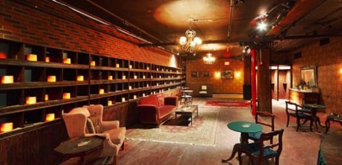
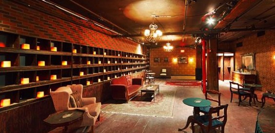
The lobby of the McKittrick Hotel, where "Sleep No More" is set


This week, I took a chance to watch Punchdrunk‘s current New York City production of Sleep No More. You may remember I previously wrote about Punchdrunk when I showed some Art Deco footlights I constructed for this production. I do not normally write about productions I see, but this was such a unique experience with a heavy reliance on props, so I thought I’d share.

First, some background. Punchdrunk is a British theatre troupe known for their immersive brand of promenade theatre. The actors are interspersed throughout a venue, and the audience is free to walk around and watch whichever scenes they wish, or just explore the space on their own. For Sleep No More, Punchdrunk has taken a set of three connected warehouses and lofts in Chelsea (former site of one of the super clubs back in the day) and transformed all six floors into a noir-ish world straight out of Hitchcock’s Rebecca, with many of the story elements from Macbeth. In other words, it’s “Shakespeare in the Dark”. The audience is given white masks to hide their faces, brought up an elevator in small groups, and set loose to explore the world and pick up pieces of the story. Hundreds of rooms have been created with literally thousands of props, with excruciating levels of detail. You can wander into a room which looks like an office, open a drawer in a desk, open a book, and find a scrap of paper with a note written by one of the characters. If it sounds like a lot of work went into this, it has; a team of artisans, shoppers and dozens of interns spent almost six months working non-stop on the physical production.

The New York Times has a wonderful article on Sleep No More. You really have to click through to the interactive feature where you can view a photo slideshow with audio commentary on a few of the hundred rooms in this piece. The pictures give you a better sense of the “look” of the place than I can describe. The “gestalt” of the piece, however, is something which not even pictures can describe. The whole experience is so intense, and the conventions it creates and exploits serve to create a uniquely theatrical event; “theatrical” in the sense that it can only be done as live theatre, with any attempt to transform it into film, text or interactive digital inevitably falling far, far short. You can read another write-up at the Wall Street Journal. Unfortunately, the New York Times article is the only source of photographs for this production, as the Punchdrunk group plays their marketing close to the vest to keep an air of mystery and discovery to the whole affair.

Art Deco Footlights

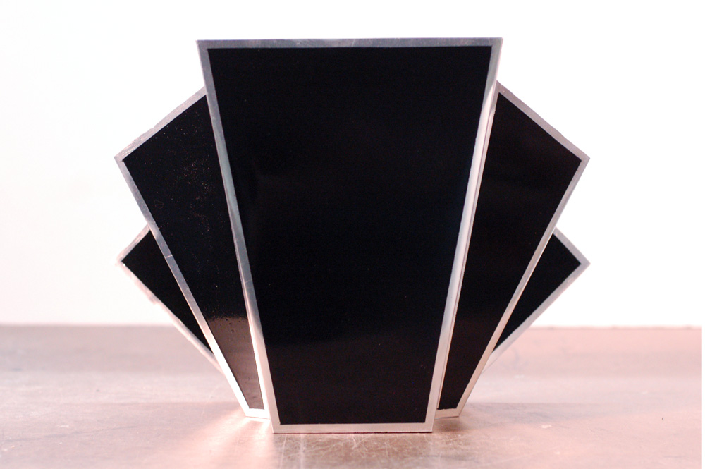
A footlight
A footlight

I recently finished up a number of footlights for a company called Punchdrunk for their upcoming New York production of Sleep No More. Their Boston production used traditional shell-shaped footlights; for this update, the stage had a giant art deco backdrop whose shape would be mirrored in the footlights.

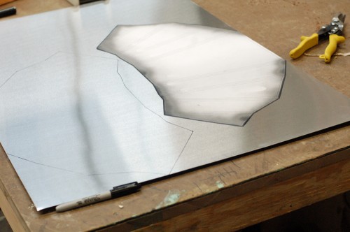
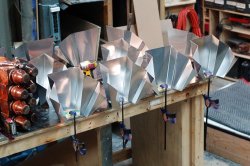
They provided me with a full-scale drawing of the piece with all the angles already figured out. I traced the patterns onto sheets of aluminum. I kept the top edge along the factory edge of the aluminum sheets; with that edge being front and center, I wanted it to be the straightest and cleanest part of the footlight. The first light I cut out using my pair of tin snips. It gave me a clean edge but took forever. I cut the next one out on the bandsaw. It was a lot faster but was harder to keep nice-looking. I ended up using both of the tools to cut, with the bandsaw cutting out the rough shape and making the easy cuts, and the tin snips cleaning up the edges and cutting the trickier parts.

Once cut, the edges needed a lot of sanding and deburring to get them nice and straight and not razor-sharp. I polished them to get them a little shinier as well.

Tracing the template

I was now ready to begin making the bends. I’ve bent sheet metal before using a hammer and some clamps, but I needed a much cleaner and more precise way to make these bends, especially since I was producing sixteen identical footlights. I needed a sheet metal brake. Not having one, I decided to make my own. I looked at a number of tutorials and plans online, and found Dave’s Sheet Metal Bending Brake to be the clearest and most useful description; he’s just a working-class guy trying to build an airplane.

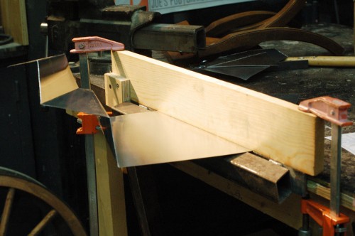
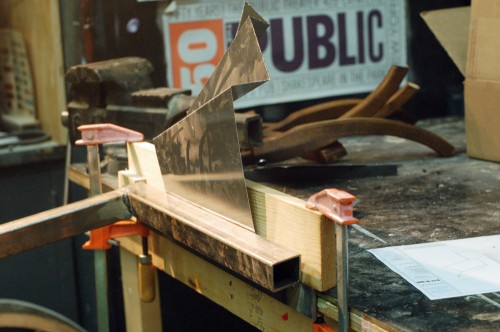
The next two photos show the brake making a fold. First, I had made a mark on a piece of scrap metal and lined it up in the brake to make a bend; this showed me where to line up the marks on the brake in order to place the fold where I needed it to go. Once I was confident with the workings of the brake, it was just a matter of making all 128 folds, one at a time.

Metal in the brake
Metal in the brake
Making the fold
Making the fold

I cut and attached MDF bases to the lights to give them a way to attach to the stage, and for the birdie lights to attach to them as well.

Attaching the bases
Attaching the bases

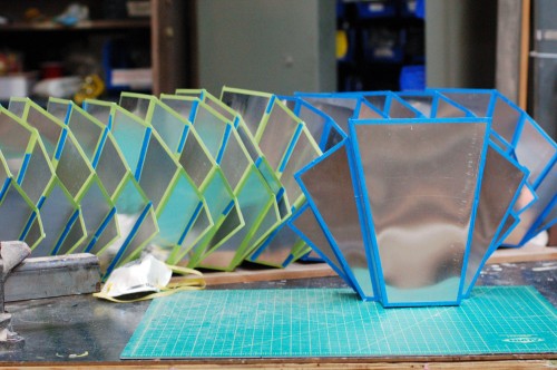
I then put masking tape along the borders of each panel. This quarter-inch area was to remain metallic while the rest was painted gloss black.

Taping the paintlines

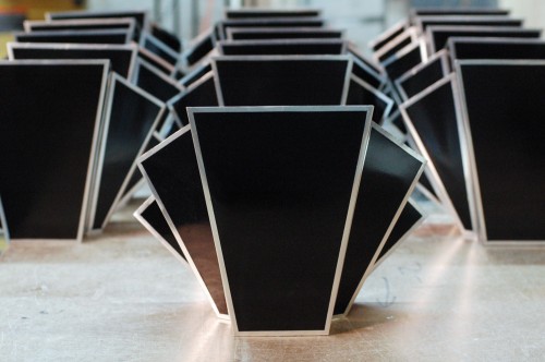
With the masking in place, all that was left to do was a couple of light coats of gloss black spray paint to build up a nice shiny and even surface.

16 footlights
16 footlights