Tag Archives: Bloody Bloody Andrew Jackson

To Broadway and Back

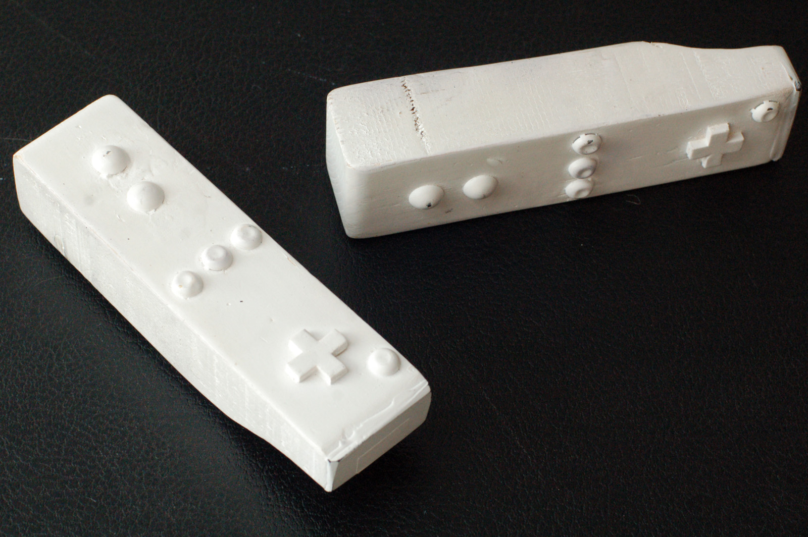
Wiimote
Wiimote

What, exactly, are we looking at? Fans of the Nintendo Wii may recognize these as vaguely resembling the remote used to play games on that system (known as the “Wiimote”).

Flashback a few years. I was working on the off-Broadway production of Bloody Bloody Andrew Jackson. Fans of the show will know that it has just a bit of set dressing, so you can imagine that the props department had their hands full. We had made it past tech and into previews, but changes were still occurring. The various sight gags at the beginning of Act II (when Andrew Jackson has just become President and is in the White House) were still evolving. A note came down that they wanted to add Wiimotes for one of the background characters to be playing with. Easy enough, right?

Well, our budget was fairly shot at the moment. We couldn’t really justify the $40+ per Wiimote (they wanted two) for a background gig. We searched high and low for used ones, ones to borrow, and even broken ones. At one point, someone found “candy” versions (a fake Wiimote filled with candy), but these proved to be too diminutive for our purposes.

“Hey,” I said. “I can make something really quick, so they at least have something in their hands while we continue searching.” I cut some shapes out of a 2×4, added some upholstery tacks as buttons and a small cross cut out of MDF for a directional pad, gave it a coat of gloss white spray paint, and called it good.

We ended up running out of time to find better ones. No one gave us any notes to improve these “stand-ins”. Opening night came. Watching the show, you couldn’t really see what was in the actor’s hands during this scene, even if you knew to look for them.

Flash forward. The show transfers to Broadway. All the props get recorded, packed and trucked off. I get tickets to see it. I pay attention to the beginning of Act II to pick up on any changes. The Wii gag is still there, but I can’t make out the props. “It’s Broadway,” I think. “They probably just bought two Wiimotes with their big budget.”

Flash forward again. It’s been over a year since the show closed and the props are still in storage. My boss pushes to get them back as the chances of a transfer diminish. After several go-arounds, he finally arranges for a trip out to the storage facility to pick up some of the items to bring back to our stock. Most of the hand props are packed into a few boxes, and we don’t really know what is in them (the boxes are labelled “action props”, which is Broadway’s term for “hand props”).

We unpack the boxes and guess what I find? Hint: It wasn’t a pair of “real” Wiimotes.

I am not sure what the moral of the story is. It is certainly an interesting side note to add to the list of strange ways and circuitousness routes which objects take on their way to the Broadway stage. Perhaps it is also a small reminder that you should always do your best work, because you never know where a prop may end up. Perhaps, too, it reveals how “theatre magic” can be created even with decidedly un-magical items.

Or maybe it’s just a funny-looking prop with an interesting story.

Salon on Being Green

Yesterday at Wingspace Theatrical Design I attended their salon on “Being Green.” The featured guests included set designer Donyale Werle (Bloody Bloody Andrew Jackson, Broke-ology), as well as Annie Jacobs and Jenny Stanjeski from Showman Fabricators.

A lot of the facts which were presented are better summed up in my post on a previous workshop I attended called “Going Green in Theatrical Design.” I did see something that was new though (new to me, that is): UC Berkeley’s Material and Chemical Handbook which presents some of the materials we commonly use in prop making, along with disposal instructions and safety notices. It’s specific to their college, but it is a good starting point for developing your own.

Since I didn’t take notes, what follows is more of a highlight of various points made in the discussion as I remember them:

“Being green is not black or white”; it is not an either/or proposition. Rather, every day you try to make better choices, and every show you try to do a little greener. It takes a lot of experimentation, a lot of analysis, and a lot of effort.

Do not do bad “green” design and art; it’s worse than no design. The goal is to make good design, and the goal of sustainable theatre is to do it a little greener each time.

As theatre people, we already come from a culture of sustainability and recycling. We reuse and repaint flats and drops. We take the lumber from one show and use it on the next. We borrow and barter the costumes and props from other people doing the same. But as our careers progress and the shows get bigger, we get away from that. Maybe it’s because you get to work with bigger budgets, or maybe it’s because you want to push your work to have higher production standards. Making sustainable theatre is a conscious choice and takes a concerted effort.

One of the problems, someone pointed out, was in trying to do a green production with a designer who was still in the old mindset—the mindset that everything has to be new and bought just for that show. What is the new mindset? It may mean a design which evolves from the available materials, rather than a design which starts on paper and then requires the purchasing of all new materials. Maybe it just means less design, though as Donyale pointed out, she likes a lot of “stuff” in her designs:

Bloody Bloody Andrew Jackson

Thinking about more sustainable options means taking more time out of your already busy schedule, and asking others to take more time as well. Donyale pointed out that if you can do case studies on what you’re spending versus what you would spend in a more traditional production, you can convince the producers; for Peter and the Starcatcher, she calculated that they saved $40000 in materials by using recycled, salvaged and upcycled materials, but that the labor cost was a third more due to all the sourcing and processing of this material. Still, it was an overall savings; the extra labor cost was offset by the reduced materials cost. Producers like to see savings. It is also, for a lot of us, morally preferable to have more of the money to go to human labor (which is sustainable) than to the purchase of materials shipped from across the globe which will end up in the trash once the show is finished.

For artisans and production people, as opposed to designers, using more sustainable techniques means taking time to do your own experimentation and comparison of materials and techniques to arrive at better solutions. If you can come up with concrete alternatives to show your designers, it becomes easier to convince them to trust you. An example the ladies from Showman gave was using carved homasote, which is made from recycled newspaper and non-VOC adhesives, to make faux brick and stone facades, rather than vacuum-formed plastic panels. Not only is the plastic a petroleum-based product shipped from overseas, but it releases toxic fumes when heated in the vacuum former. Homasote comes from a company in New Jersey, so it only has to travel a few miles. The results look the same, and the costs are comparable. By showing the designers what they can achieve with more sustainable and less toxic materials, it makes it easier to convince them to accept them.

Elevenses Links

Happy October 29th! Or for those of you on the Gregorian calendar, happy 11/11/11!

From Ryan Voss comes this fantastic-looking blood recipe based off of Crayola washable markers. They said they used it in a production where a character in a white wedding dress was covered in blood every night. (h/t to Propnomicon)

So Field & Stream, of all places, has a behind-the-scenes look at the props of AMC’s upcoming western show, Hell on Wheels. They focus a lot on the guns used and how they achieved the many gun effects in the show, but be sure to make it to the bottom of the article, where they have a video on building an entire train. That’s right, an historically-accurate steam locomotive made of styrofoam, wood and a fog machine. I thought my cannon was cool, but this is simply amazing.

You’ve seen some of this before on my blog, but Rosco shared a more in-depth look at how we made the portraits for Bloody Bloody Andrew Jackson.

This looks strange and promising. Autodesk has a free preview of their 123D Make software, which will turn a 3D computer file into something you can print out, cut apart, and assemble into a three-dimensional object. They have a video which does a better job explaining it. The software is only available for Mac, and it is only free until February, so if anyone with a Mac tries it out, let me know how it goes.

Mantle Studios has a very well-made tutorial on sculpting with wax. I’ve done a bit of wax sculpting, but nothing approaching the level of detail in this tutorial.

Monday Morning Minutia

Traveling and unpacking have kept me from delving deep into my own writing, but the internet still has plenty of interesting things for the props person.

  • “Sheepless” Magazine has a nice feature on Paper Mâché Monkey, the theatre design studio run by Grady Barker and Meghan Buchanan. They did some work on our Measure for Measure this summer. Before officially starting their company, they also took over the prop fabrication on Bloody Bloody Andrew Jackson and Merchant of Venice when they moved from the Public to Broadway. It’s a well–put together article, and great to see them starting to get some attention.
  • I almost missed this the first time around, but Erich Friend highlighted some new fake candles on this Theatre Safety Blog. These were designed and patented by Disney Imagineers to go in the newly renovated Haunted Mansion. They look much more like real candles than previous versions, especially up close (at least, they do in the videos). I hope the price is right when they finally become available in the US.
  • Finally, About.com has a brief article about “Hero Props”, the company run by Seán McArdle.

Congratulations Bloody Bloody Andrew Jackson

The musical Bloody Bloody Andrew Jackson recently won two Lucille Lortel Awards for both Best Musical as well as for best set design by Donyale Werle. Just yesterday, the Broadway version was nominated for a Tony award for best set design as well. Since I was the assistant props master on the off-Broadway incarnation (and the Broadway production was almost a direct transfer), I thought I’d write a bit about the props and set dressing of this award-winning scenery.

The props themselves were not too challenging (well, maybe some of them were); really, when you think of the set for Bloody Bloody, you think of the set dressing. It did not just cover the stage, it exploded out into the audience.

It’s interesting how the set dressing evolved during the show’s journey to Broadway. The show had a 2006 workshop at Williamstown Theatre Festival and a 2007 one at New 42nd Street Studios. It premiered in an LA production by CTG in 2008. We first did it at the Public in 2009 (I did some artisan work on that production) before its off-Broadway premiere in 2010. Every step of the way, the set design evolved and grew, and elements of the set dressing traveled from production to production.

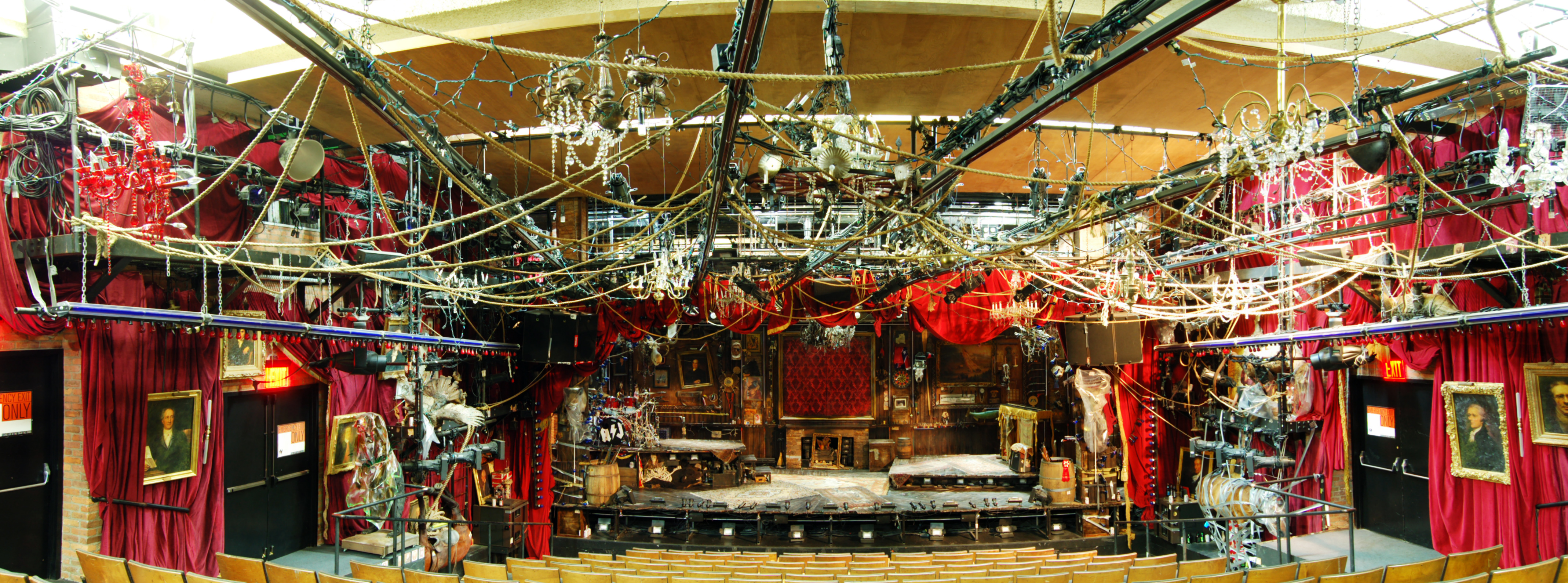
So when the show got to us in 2010, we not only built, bought and otherwise acquired a whole theatre’s worth of stuff, we also unpacked several boxes worth of detritus that had accumulated during the previous incarnations. I took a few photographs of the upstage wall and assembled it into a panorama so you can see just a tiny portion of the amount of dressing and detail which went into this show.

Back wall of the Bloody Bloody Andrew Jackson set

To place that wall into context, I also have a photograph of the set taken from the back row of the Newman Theatre.

View from the back row

I could try to remember the details of all the set dressing pieces, but it turns out Time Out Magazine has a wonderful slide show of the Bloody Bloody Andrew Jackson set with descriptions by Donyale Werle, so check that out instead. Amongst the clutter was the horse from the Public’s production of Kicking a Dead Horse as well as parts of the body I worked on for The Bacchae.

When this production closed, it was time to pack it up for Broadway. Normally when preparing our show documents, we would photograph and list all the set dressing; that would have been a monumental and difficult task in this case (we would have to write sentences like “a piece of duct tape is attached to a rope and stretches down to a horse which has a beer bottle underneath it”). Luckily, Donyale is highly organized and took most of her own reference photos and described them in a way that made sense to her. We just had to inventory, pack and label everything so the Broadway team could unpack it in their theatre.

They obviously added a whole lot more as well; the sum of all our items would only fill a small portion of a Broadway house. The New York Times covered the set design of the Broadway version as well as creating an interactive tour complete with narration by Donyale and her team.