In my previous post, I discussed what to include in your props portfolio. In this part, I will discuss how to layout, organize, and present your portfolio. I’m going to use my own portfolio as a guide; there are certainly many other ways you can make your portfolio.
Layout
There are a number of ways to layout your pages. You can of course do it by hand, where you make copies of all your photographs and drawings and glue them to paper or a heavier board. Or, if you want a less time-consuming and cheaper method, you can do it on your computer. For simple layouts, you can use any number of software programs, depending on what you are already comfortable using or what you have access to. I use Scribus, an open-source desktop publishing program. I know people who use Powerpoint. You can even use a word processor if that’s what you like working with. You basically need to fit images and text on a page, so your options are limitless.

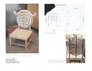
Above is a sample page showing a single prop. It’s always great when you can have a designer’s drafting side-by-side with the final prop to show that you can interpret drawings. It’s really cool if you can show a prop next to a photograph of a real object to show how closely you can replicate something. For this prop, I’ve also included a process shot to show a structural element which ends up hidden in the final piece. I also have a bit of text to explain why that photograph is there; the other pictures do not need text because an explanation would be redundant. The rest of the text gives the show name, the name of the prop, the designer on the show, the theatre and year it was produced.


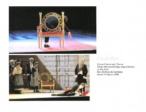
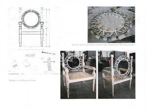
It may happen that the photographs and ancillary material for a prop is too much to fit on a single page. As my portfolio is in book form, I can have a prop spread over two pages. Above is an example of one of the two-page spreads in my portfolio. The performance shots are not only visually interesting, but each one shows the prop from a different angle. The process shots give a clear example of the materials and methods used to construct it. There may be some redundancies in the presentation, but it is such an interesting prop, and it featured prominently in the show, so until I add a more interesting prop to my portfolio, I will probably keep it spread out over two pages.

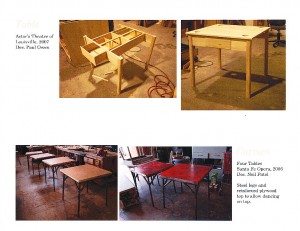
Some props you build may be well-done but not interesting enough to devote an entire page on. I like to group these together, and have two or three similar props, like the tables in the picture above, combined on a single page.
Order
Now you get to the fun part of putting your pages in order. You should start off with the most eye-catching prop. Maybe it’s the most interesting-looking, or maybe it’s the one that you have the most dramatic photograph of. In any case, you’re trying to capture the viewer’s attention, and the best way to do that is with a strong first impression.
Your second page should have the best example of your work. It should be interesting like your first page, but instead of showing the most eye-catching prop you’ve made, this one should be the most skillfully made. You want to create a trend in your viewer’s mind, that every page will be better than the last. You also want to show off the best of your skills as soon as possible.
After that, how you organize your pages is up to you. Think about the fact that your viewer may stop looking through your portfolio at any time. With that in mind, you should keep the order varied, and have your best examples toward the front. When you have your pages in order, pick a random point in the middle and pretend any pages after that point don’t exist. Do the remaining pages still give a good impression of what you can do as an artisan?
Finally, you want to leave a strong impression at the end. Pick a solid prop as your last page. It should be almost as exciting as your first and second page. I’ve been on interviews where we look at my portfolio, and after getting to the last page, my interviewer leaves my book open as we go through the rest of the interviewer. Think about the fact that the final page of your portfolio may sit there for half an hour or even an hour, staring up at both you and your interviewer. You don’t want a mediocre or embarrassing prop glaring at you while you try to describe how great of an artisan you are. Your final page can also serve as a conversation starter. If it’s a particularly unique or quirky prop, either in appearance or method of construction, it can give the interviewer something to ask you about when you are done going through the portfolio.
Presentation
I print my portfolio onto standard letter-sized pages and keep them in sheet protectors in a three-ring binder. When I add new props to my portfolio, I only have to print out the new pages, rather than a whole new portfolio. It is simple to change the order or take some pages out for a specific interview if I want. I keep the size small because I can carry it with me everywhere. I’ve shown my portfolio in offices, hotel rooms, and even standing up in shops. A larger or bulkier portfolio would keep me from doing that.
If you are participating in a portfolio fair or setting up a display of some kind, such as at U/RTAs, you’ll probably want to mount some photographs and pictures to larger boards. For your main portfolio though, think more in terms of usability and ease of transport.
I’m a firm believer that content will outshine display. You may think there are more elegant methods of presenting your portfolio than a three-ring binder and sheet protectors. There are a whole host of products available for storing and presenting your work. Feel free to use whatever you want, just keep in mind that your portfolio should not put you into debt, and you should not avoid updating it because it is overly complicated. Remember too that there is no binder so fancy that it will overshadow mediocre work.
These days, having a digital version of your portfolio is just as important, if not more so, than a physical one. Whether you have it on a website, on a disk you can hand to people, or in a file you can email, you can reach more people over greater distances. You can have a phone interview with a props shop in another state while both of you go through your portfolio on the computer. More people can have a copy of your portfolio without you having to take the time and expense of printing multiple copies on paper.
When I’m finished working on my portfolio on my computer, I turn it into a PDF to print from. At the same time, I make a PDF at a lower resolution. This file is small enough to put on my website for people to view. I can also email it to those who ask. If I’m sending an unsolicited email, or my recepient cannot accept attachments, I can just send a link to the file on my website. With this workflow, I can keep my printed and digital portfolio in sync with each other.


Eric, Once again thanks for a great post. I wanted to add a few more comments from my experience reviewing portfolios and hiring.
Content is important, but so is presentation. The portfolio should look professional. Pages need to be laid out nicely, and there should be no spelling or grammatical errors. While you can do a printed page, texture can convey more feeling. A portfolio shows not just your past work, but can reveal your personal sense of artistry and attention to detail. If I am looking to hire someone, and their portfolio is sloppy, how can I expect the applicant to offer me a better product under my employ?
I have to say, I disagree with a binder. I am glad that it works for you, but I tend to only see binders used for show books (sometimes TD’s, but most often SM’s). Instead, I would suggest taking a look at traditional portfolios and scrapbooks. Many of these offer removable pages that you can easily slip out to update and you can buy them in sizes that can be run through a printer as well. I personally use a black 12â€x12†scrap book which cost about $5, and got constant compliments from when I was looking for a job a couple years back.
I also want to reinforce order. Put the best work – the stuff that you’re proud of or that shows off your skills first, not what is chronologically newest. This is particularly the case when you are at a conference where you have about 15 minutes to make the best impression you can. I try to ask towards the end of the interview if there is anything else that they feel I should know or see that they haven’t been able to present, and I can’t tell you how many times the person I am interviewing flips the their portfolio to show some picture we hadn’t gotten to due to the compressed time frame of the interviews. The flip side of this is – be aware of what time you have to display your portfolio and size the amount of work included to adequately fit into the time frame allotted, allowing for discussion and questions. Quality is much more important than quantity.
Keep up the good work Eric, looking forward to reading more of your posts!
Hi Jean,
Thanks for the comments and suggestions.
I do think presentation is important. While a binder may work for me (though I’ll admit I’ve never gotten any compliments on mine), for an emerging artisan, every little bit of attention to the portfolio will help out. The point I was trying to make was there are professional-looking presentation methods which can be had for as little as $5. There’s really no need to browse through the portfolio store looking at cases which run in the hundreds (or even thousands) of dollars.
Thanks again for your perspective on all this!
Hi Eric,
Nice job on the articles, and on your portfolio!
I saw your post on TheaterFace, and thought I’d check it out.
I’m primarily a freelance scenic artist, but I do props and minitatures work as well.
I have a few things I’d like to add to your suggestions on how to compose and layout a portfolio- Websites and Brag Books.
As for the website, you’ve got that down. I’m not fluent in DreamWeaver, and I don’t have the skills to create my own website. However, I came across CarbonMade.com and DeviantArt.com, both of which offer free, pre-formatted portfolio hosting. I know some people who also use Blogger as a portfolio site, too. CarbonMade is free for up to 35 images- you just have to upload them, add captions, and decide on a few layout and color options. You can pay if you want to add more pictures. They’re really professional looking. DeviantArt is less slick in terms of layout and formatting, but they’ve got unlimited photos. I find it really useful to be able to direct a potential employer to my website to get a quick overview of my work before we choose to schedule an in-person interview, or for out-of-town clients to see what I’m about. I’ve been able to do long-distance phone interviews this way, with both me and my interviewer looking at my website in together in different locations.
As for the Brag Book- this is a new idea I just heard about from a friend of mine, and I think it’s fantastic for freelancers like me, who are constantly meeting new employers and coworkers- any of whom might be interested in hiring me in the future. The suggestion is to make a mini-version of your portfolio, with small shots of just the ‘greatest hits’ included. I’m using one of those 4×6 photo books you can easily pick up at a dollar store or walmart. A full portfolio is a heavy and delicate thing to lug around with you all the time, but this small-format portfolio can stay in your work bag or purse every day, and you can pull it out to show someone informally on the job.
Hope that comes in useful.
Valerie
ArtsLynx has a great post on presenting a theatre design portfolio, which is very useful to the props artisan as well.